Rossendale Responsible Rescue
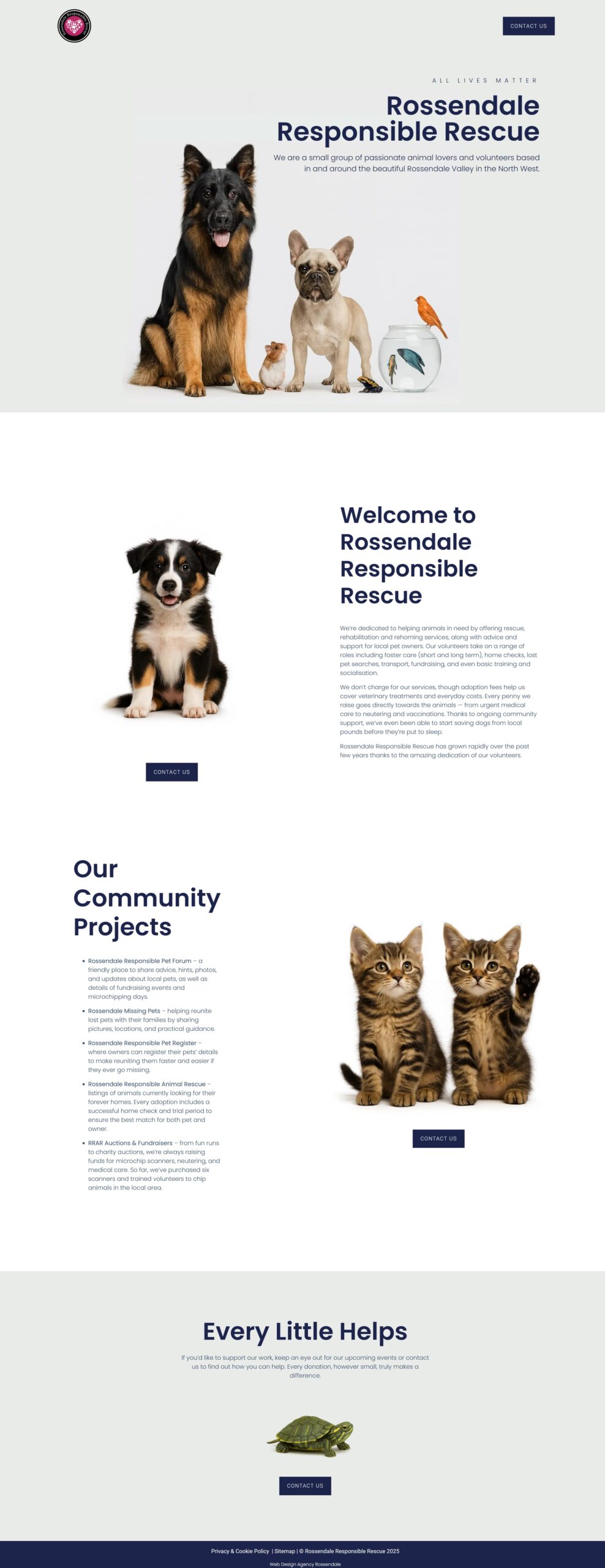
The new Rossendale Responsible Rescue website is clean, modern, and easy to use. It uses large images, bold headings, and plenty of white space to make the content feel calm and professional. The layout guides visitors naturally through each section, and the design works perfectly on all devices. This new site was built in Elementor and fully custom-designed — not from a template.
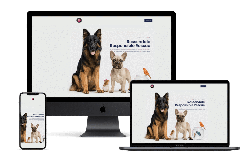
New Website Layout
What Makes the New Design Stand Out
- Modern typography that is easy to read
- Professional images used as focal points
- Clear sections with simple messages
- Smooth spacing and alignment for a premium look
- Mobile-friendly design that looks great on all screen sizes
- Strong visual hierarchy so visitors know where to focus
- Clean navigation and clear call-to-action buttons
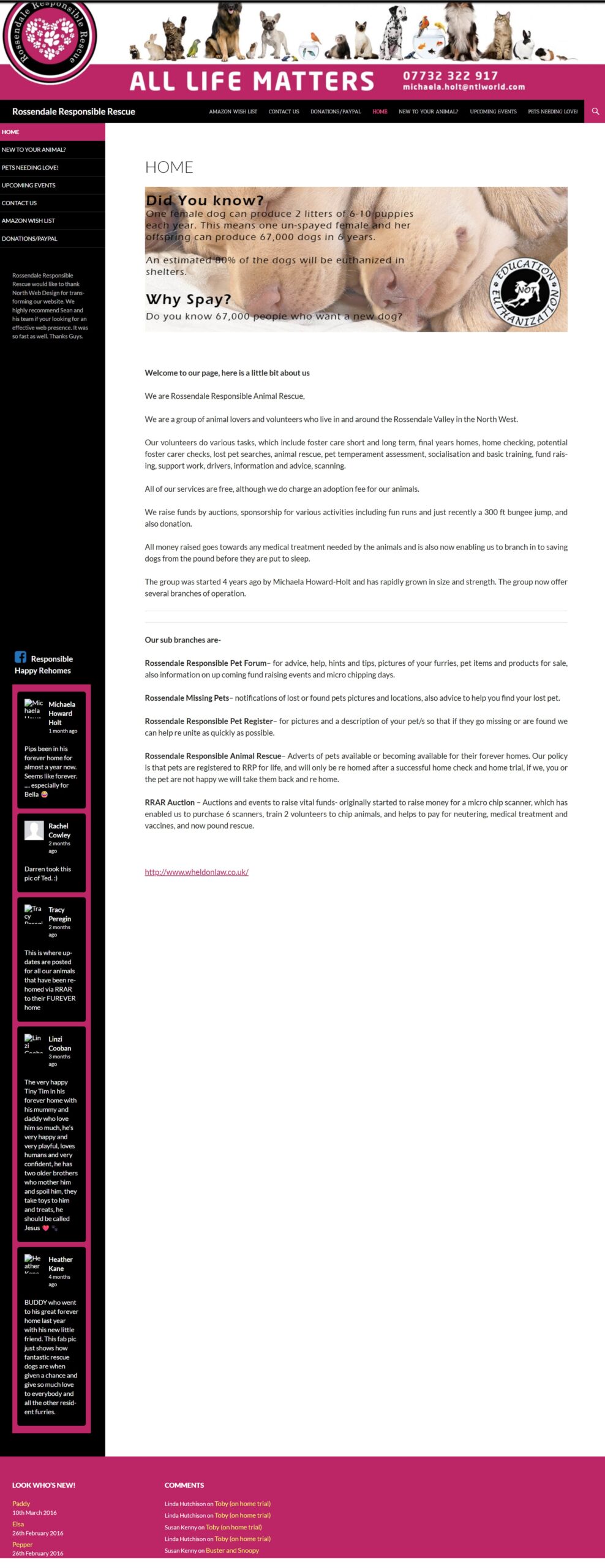
Why the Old Website Was Poor for Users
The old website felt cluttered and outdated. It used too many colours, small fonts, and tight spacing, making it hard to read. The sidebar, long text blocks, and busy header made the layout confusing. It wasn’t visually appealing, and users had to search to find information. The design did not work well on modern screens or mobile devices.
Overall
The new design creates trust, looks professional, and offers a smooth user journey. It reflects a modern charity website and gives visitors a much better experience from start to finish.
Old Website Layout